Avatar
Overview
Avatar can be used to represent people or objects. It supports images, icons.
Anatomy
- Container
- Call to action button
States
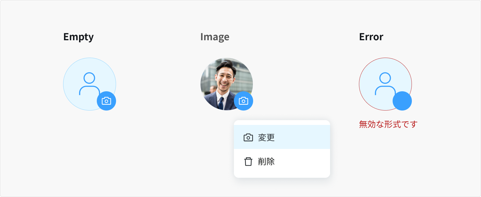
Empty
- By default, avatar displays the person icon.
Image
- When user has selected an image uploading into the container.
Error
- When the selected image is invalid.
- Or when this state requires a user response before data can be submitted or saved.
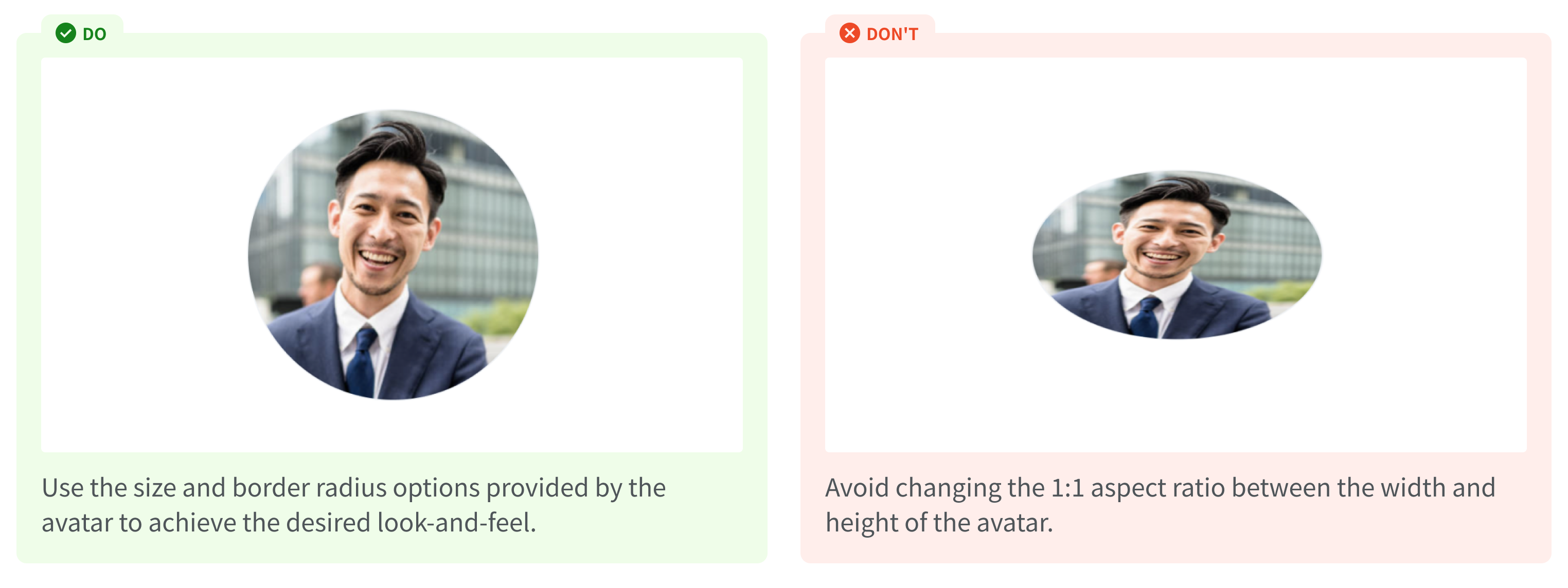
Sizes
Preserving aspect ratio, attempt to ensure the image covers both provided dimensions by cropping/clipping to fit.
- Format: jpg, jpeg, png
- Max: 5MB
- Min: 80x80px
- Ratio: 1:1
Content
Container An avatar image is added to a profile, group, or project by a user.
Call to action Use side-nested icons / rounded buttons to clarify upcoming actions when Avatar is clicked.
- Swap the icon according to the result the user is about to expect
Usage Guidelines
When to use
- To show a user's image along with contextual information.
- To attribute an action to a user.
When not to use
- The Avatar usually displays an image or icon that requires equal height and width. Changing its 1:1 ratio will distort the component and the content inside will be displayed improperly.
References
Ant design - Avatar
Line design system - Avatar
Set product - Avatar